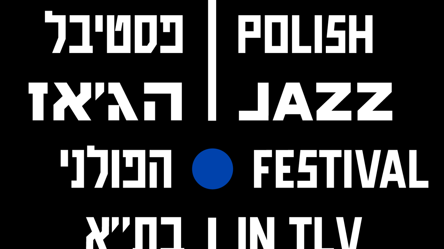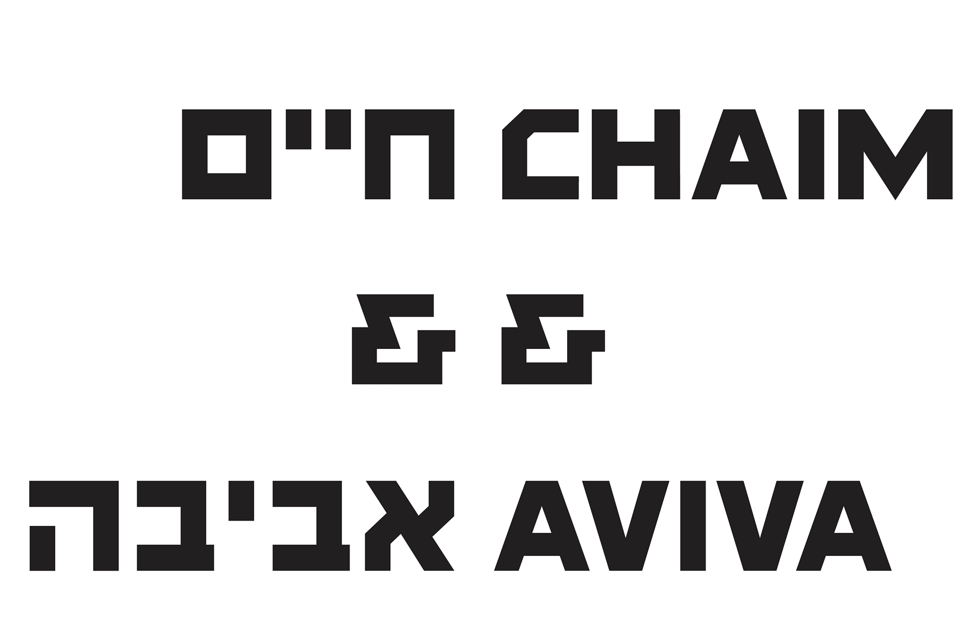
Chaim means „life”. Aviva means „spring” but also „rebirth”. Chaim was originally a Hebrew typeface designed around 1929 in Warsaw by Jan Levitt to set newspapers and other prints in Yiddish. It was considered very modern and avant-garde because it did not refer to the traditional calligraphic script. It quickly gained popularity and was widely used for posters and banners, first in Palestine and then in Israel. Until recently, it was one of the most popular typefaces in Israel.
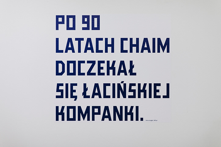
Aviva was also designed in Warsaw as my graduation project in Communication Design. I spent almost half a year in Israel to research archives and interview specialists in the history of Hebrew type design. The conclusion was that Chaim is no longer present in the typographic landscape. I wanted to restore it to use by making new digitalization and designing a complementary Latin. Through this symbolic action, I wanted to emphasize the problem of the Latinisation of typefaces and reverse the typical Latin-centric direction of multi-script design by starting the design process from a non-Latin script.
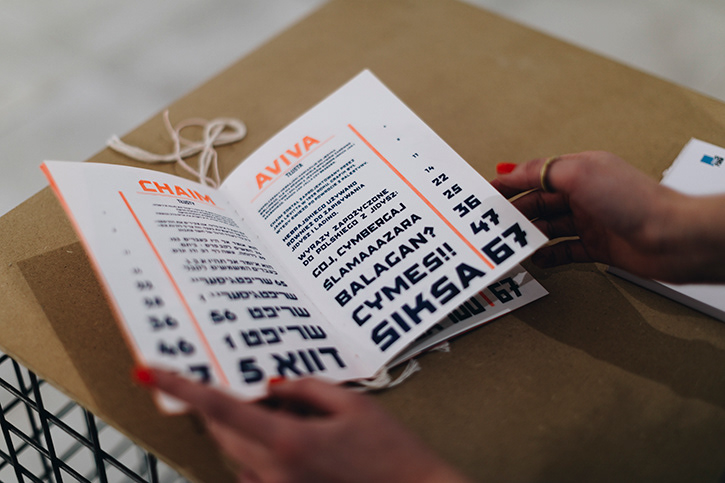
In the beginning, the new typeface has two weights – bold and condensed, just like the original. Now it was expanded into six weights. It contains an original and new set of digits and some completely new glyphs (like ampersand) and Polish diacritics, making it easier to use.
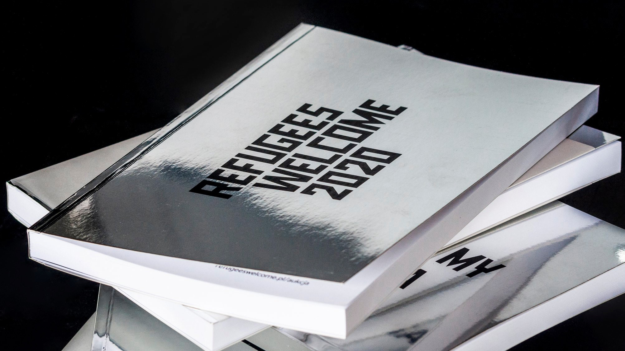
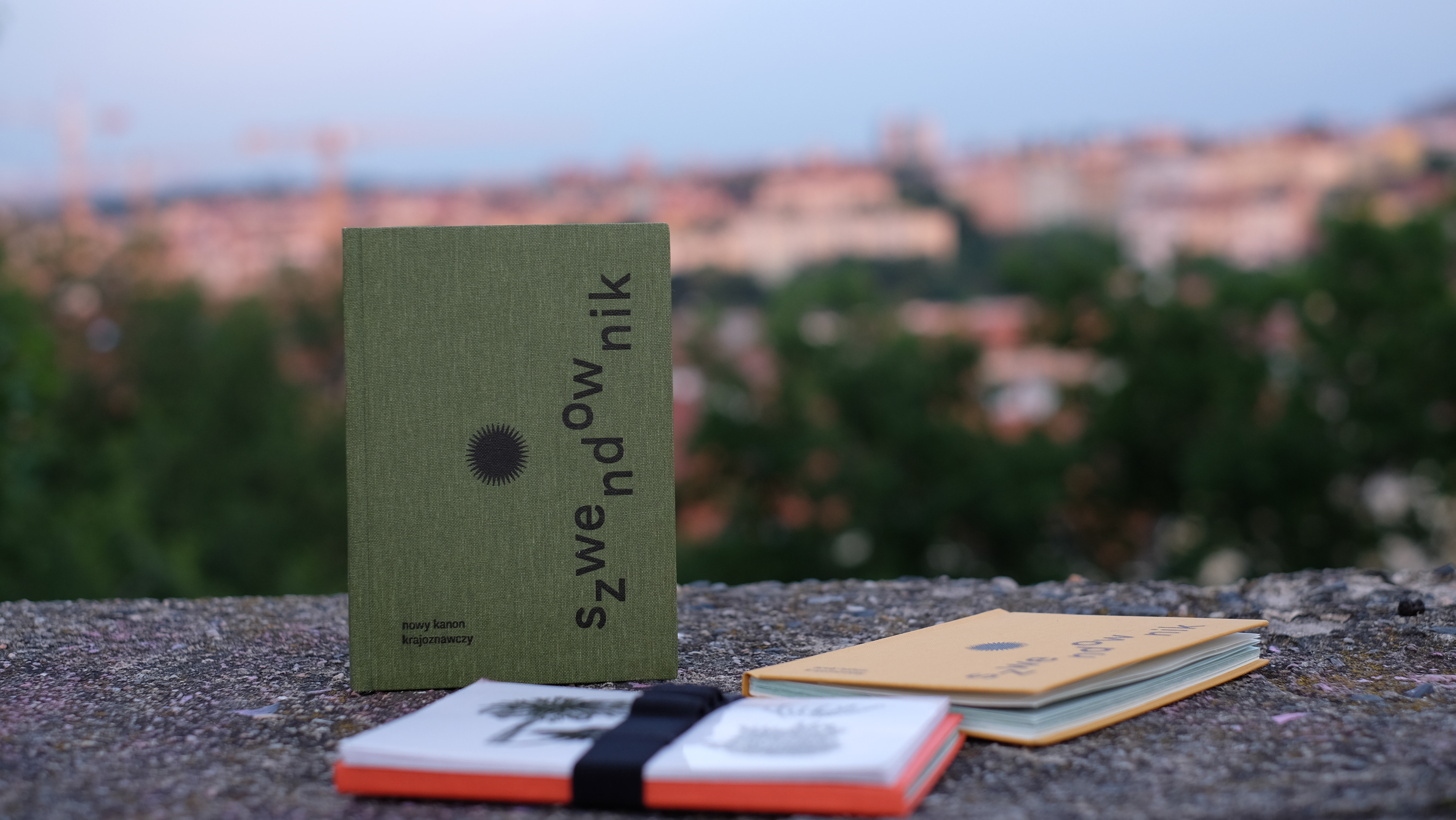
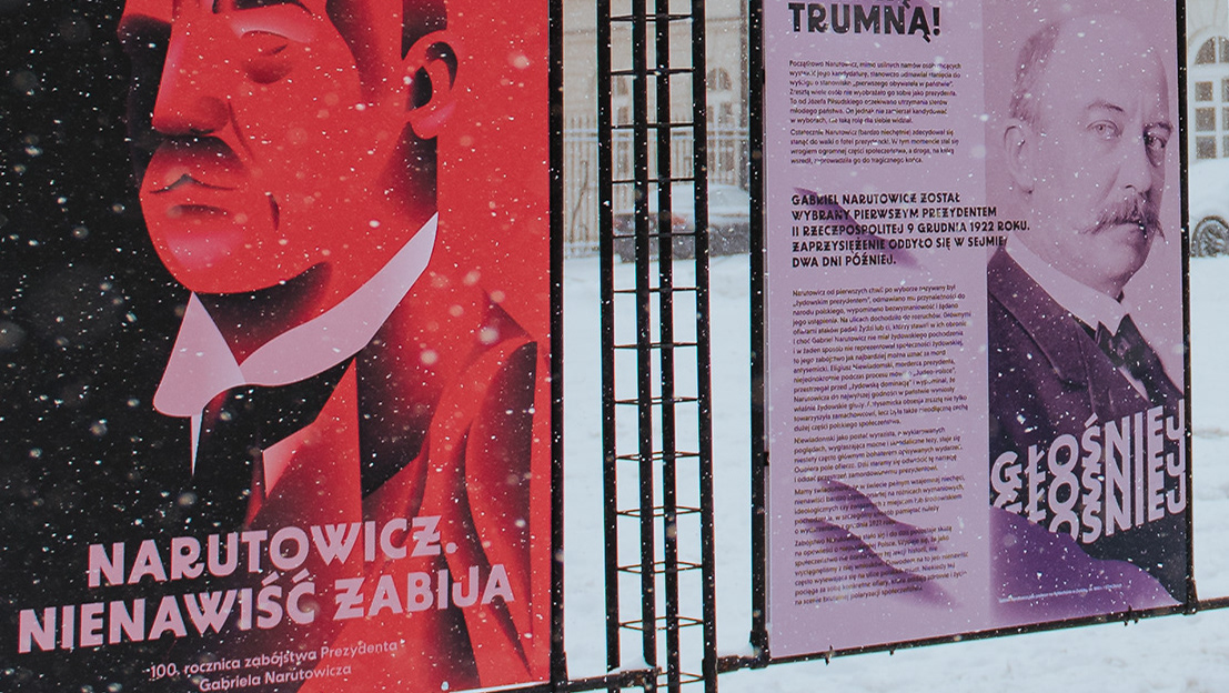
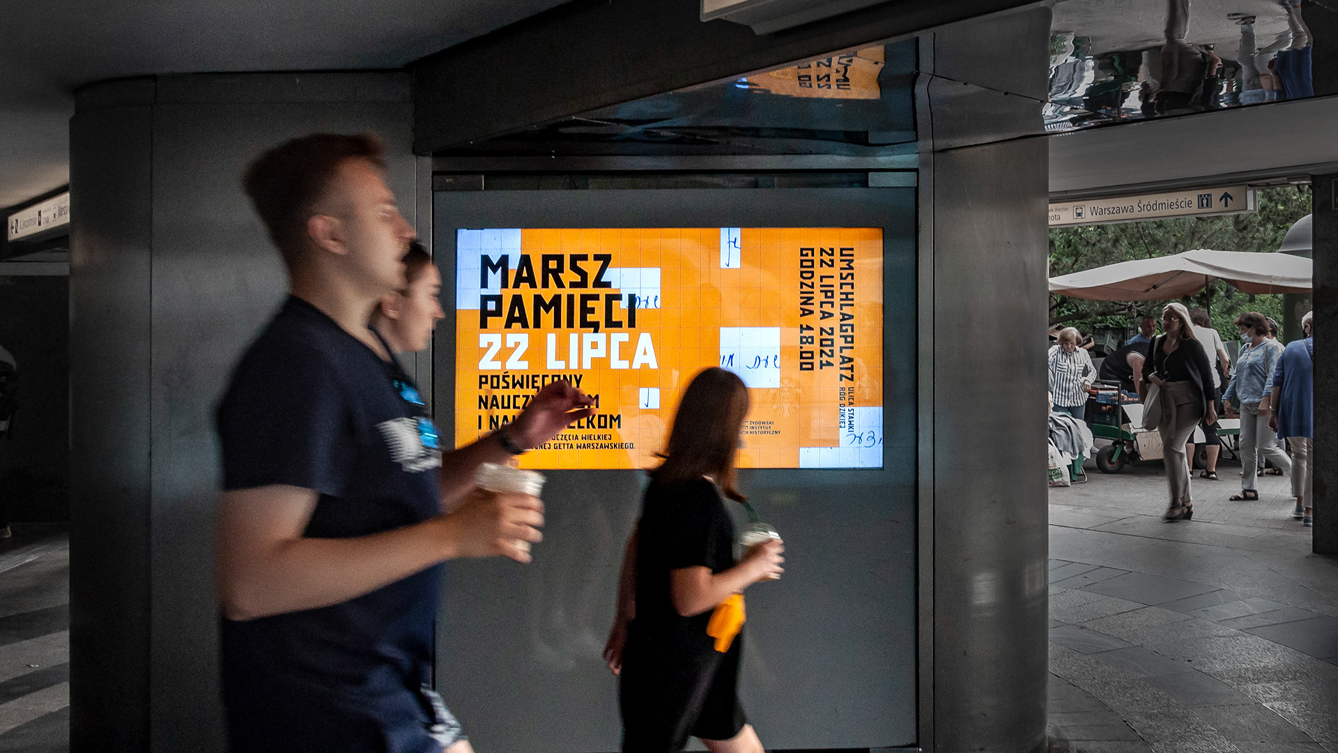
It has already been used in the visual identification of Yiddish Cultural Center, Epifanie Music Festival, Refugee Welcome, Marsz Pamięci, and more.
Idea and Project: Zofia Janina Borysiewicz
Cooperation & Font Production: Nika Langosz
Hebrew Consultation: Liron Lavi Turkenich